Resource Hub

Web, UX, Product Design
Apr 2024 - Present
The Goal
Phase 01
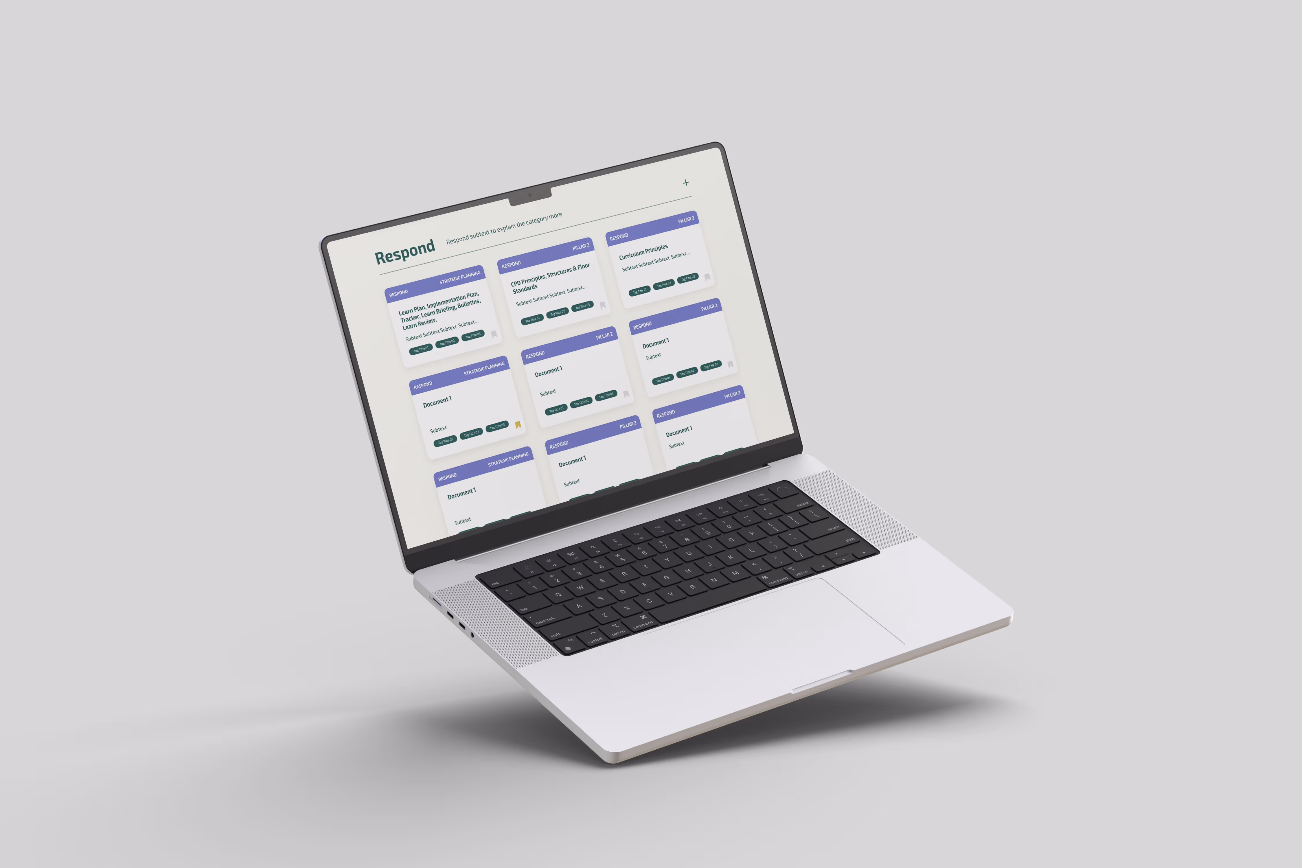
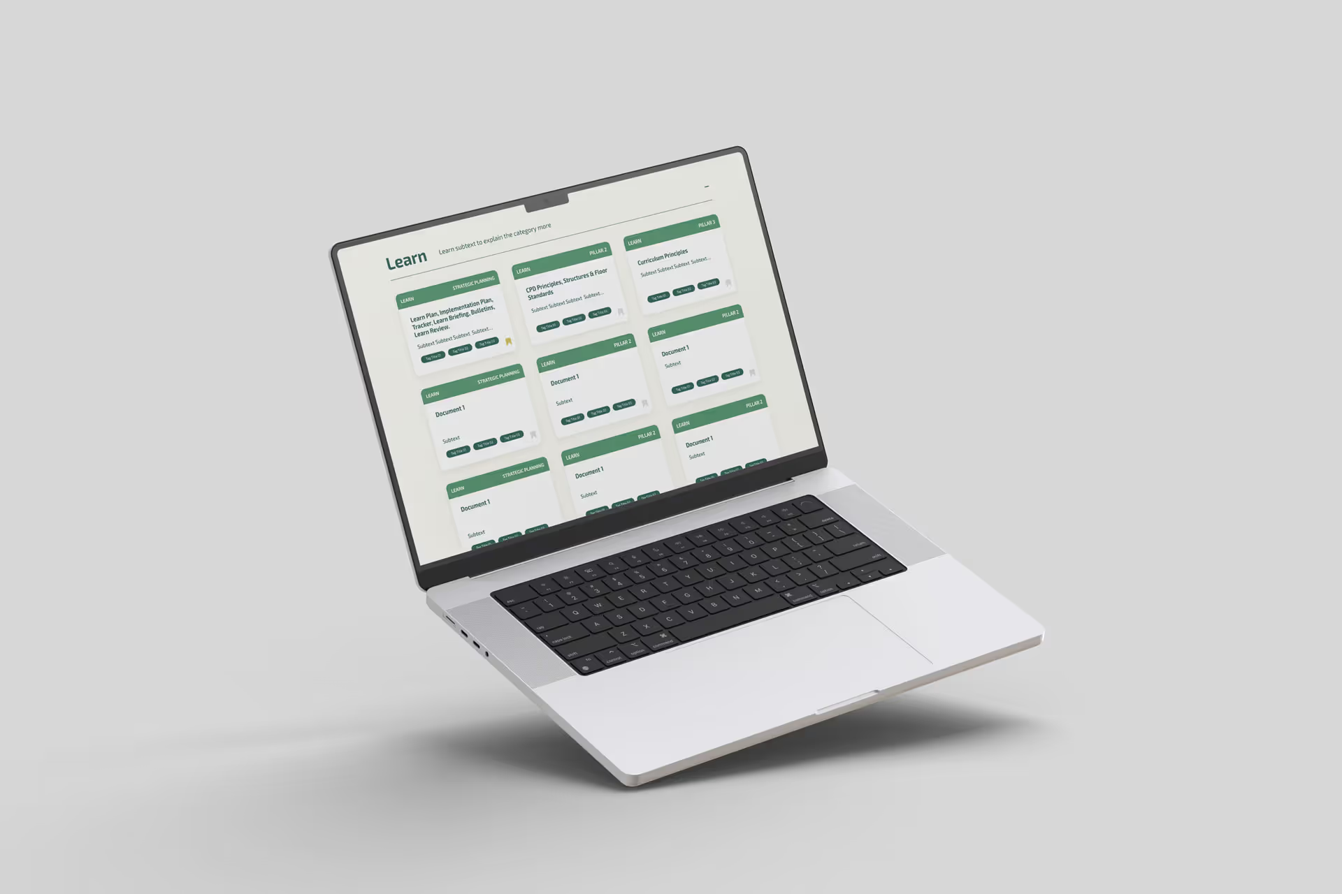
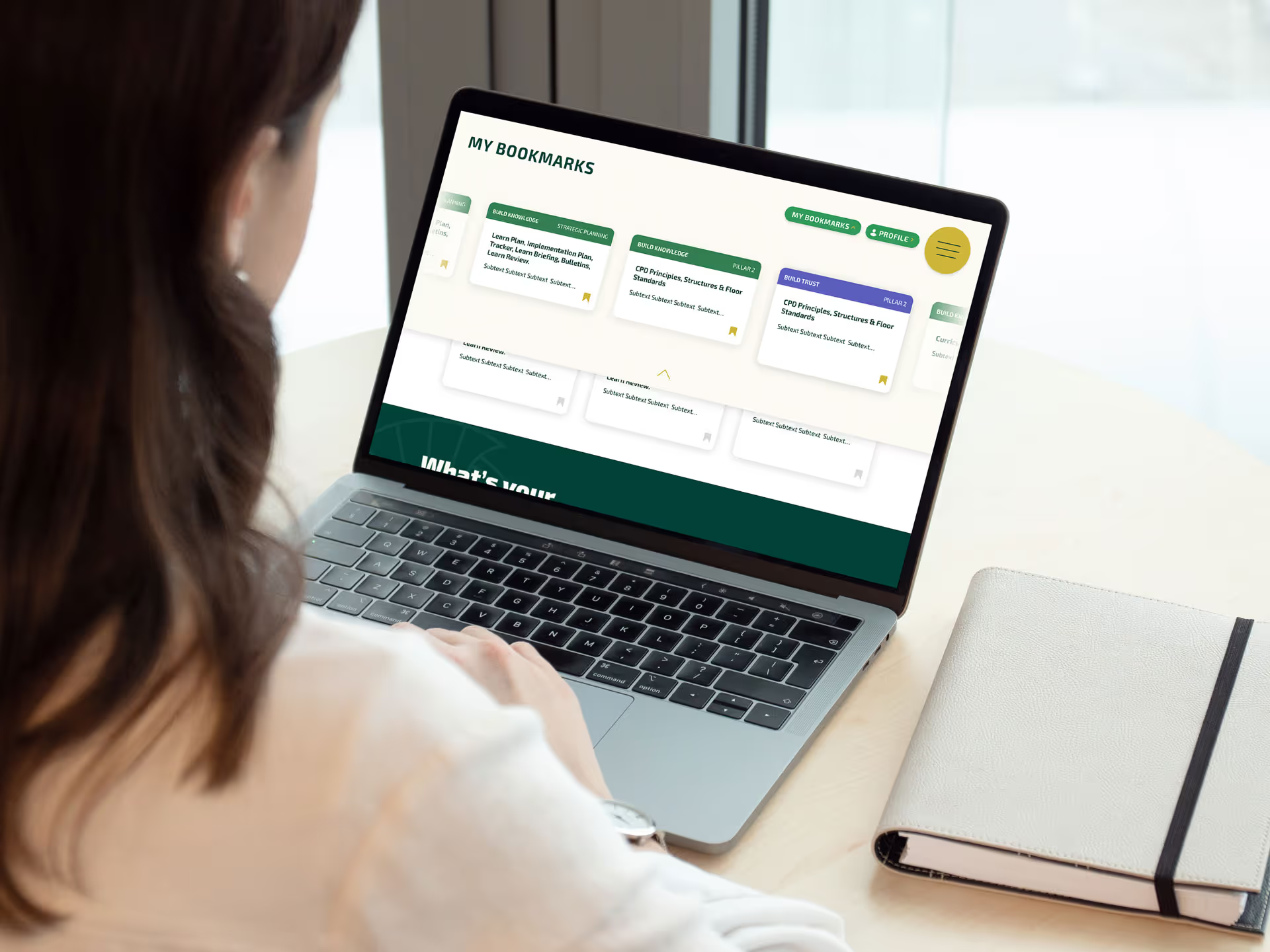
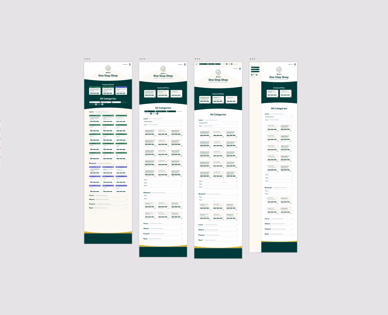
A network of independent schools needed a centralised digital platform where teachers could easily access, share, and organise educational resources. Each school had previously managed its own content, resulting in duplication, inconsistent formatting, and difficulty finding relevant materials. The goal was to create a scalable, intuitive platform that unified the resource experience across schools. The platform was designed to serve teachers first, providing an easy way to search, filter, and upload lesson materials, articles, and best practices.
The Discovery
Phase 02
I worked closely with the client’s communications and digital teams to understand how teachers use and manage resources daily. The process combined stakeholder workshops, UX mapping, and iterative prototyping to ensure the system met both functional needs and usability goals.
The Research & Ideation
Phase 03
Early discovery sessions revealed that most teachers relied on local drives or outdated intranet systems, making it difficult to find or share materials efficiently.
Through interviews and task mapping, key user needs emerged:

• Quick access to reliable, up-to-date content
• The ability to filter by subject, year group, or resource type
• A consistent, familiar structure across all schools

These insights formed the foundation of the platform’s structure and core feature set.
The Wireframing
Phase 04
I mapped user journeys for both resource consumers (teachers searching for content) and contributors (teachers uploading materials). The flows focused on minimising friction, reducing the number of clicks to find or post a resource, while maintaining clarity around content ownership and tagging.

Low-fidelity wireframes were used to explore how resources could be presented dynamically across different screen sizes. Early versions tested filtering options, content hierarchy, and visual density.The design prioritised speed of scanning and simplicity, ensuring teachers could find materials within seconds, even with large datasets.
The Solution
Phase 5
Building on existing brand guidelines, I introduced a flexible design system of modular cards, colour-coded subjects, and responsive layouts.

The visual language was designed for clarity and calm, avoiding visual clutter while emphasising function over form.Each component was designed to work across multiple devices, ensuring accessibility and consistency whether a teacher was browsing on a classroom computer or tablet.