Western Reserve Academy, Ohio

Web, Art Direction
Apr 2024 - Present
The Problem
Phase 01
Western Reserve Academy was at a pivotal moment. As they approached their bicentennial, they saw an opportunity to not just celebrate their history but to redefine how they presented themselves to the world. Known for their innovative spirit and bold personality, WRA was ready to push creative boundaries in a way few schools would dare. However, their existing digital presence didn’t fully capture the energy, breadth, and vibrancy of their offering. They needed a bold, dynamic website and creative that would do justice to both their past and their future.
The Discovery
Phase 02
As I immersed myself in WRA’s world, I quickly realised that this was no ordinary school. Their academic and extracurricular offerings were vast, ranging from traditional subjects to unexpected, cutting-edge programs like Cancer Immunology. Beyond academics, WRA had a personality that was impossible to ignore loud, confident, and bursting with energy, it came through in everything they did.

I also uncovered the striking beauty of their campus, nestled in the historic town of Hudson. Their 200-year history was woven into the very fabric of the school, adding depth and richness to their story. It became clear that my work needed to capture not just the breadth of their programs but also their bold personality and deep sense of place.
The Solution
Phase 03
With WRA’s bicentennial as a driving force, I set out to create a brand and website that would feel as dynamic and boundary-pushing as the school itself. They challenged me to go beyond the expected, embracing a creative approach that would celebrate their history while positioning them as a school that never stops evolving.
The Website
Phase 04
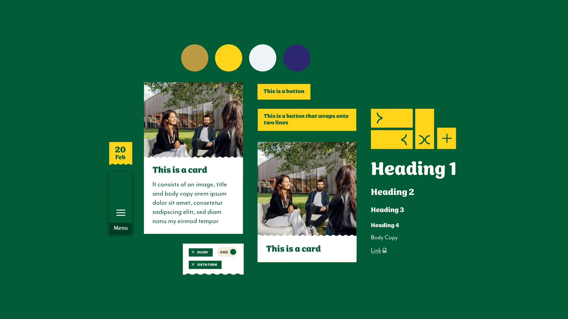
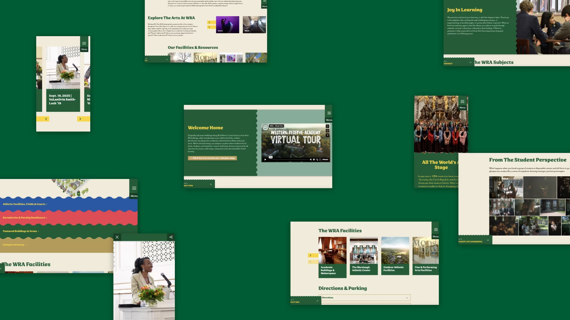
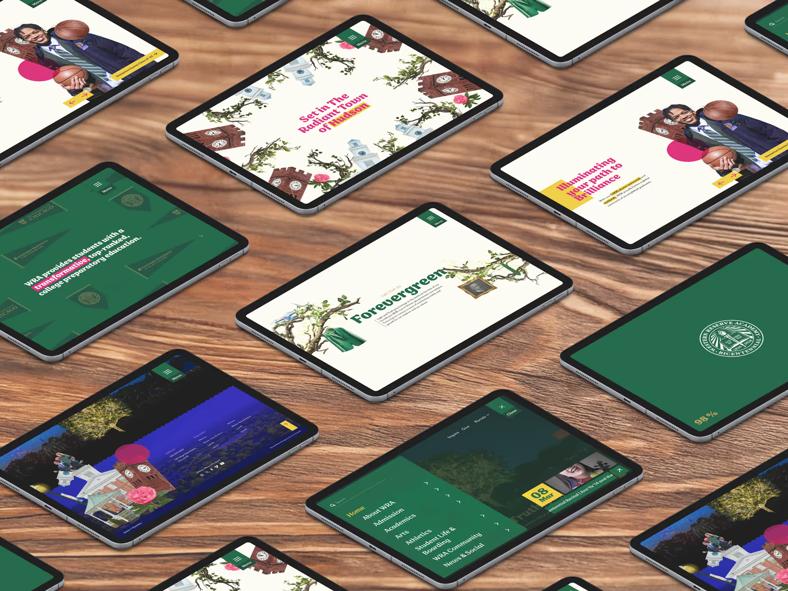
WRA wanted something daring, and they made sure I delivered. I initially presented three bold and vibrant design concepts, but instead of choosing one, they pushed me further, challenging me to take the ideas to new heights. Their newly updated brand guidelines added another layer of direction, shaping a final experience that was immersive, high-energy, and unapologetically WRA.

I designed every detail of the website to engage and surprise. Playful motion design and unexpected interactions created a dynamic user experience, while hidden easter eggs rewarded exploration. The sense of discovery and exploration reflected the school’s unconventional spirit, ensuring that every click felt like an extension of WRA’s personality.
The Creative
Phase 05
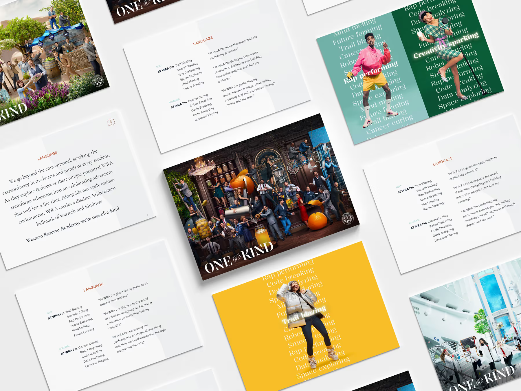
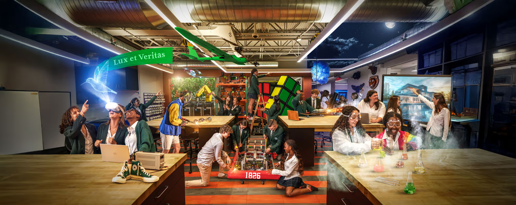
The creative direction for WRA needed to be just as bold as the school itself. Instead of using traditional school photography, I developed a composite visual style that layered multiple activities together in a single shot. This approach symbolised the immense variety of experiences and opportunities available at WRA, from their rigorous academics to their wildly unique programs.

Beyond the visuals, the language and storytelling I crafted were equally daring. The copy was vibrant and engaging, capturing WRA’s confident voice and reflecting their willingness to stand apart. The bicentennial added an extra layer of depth, inspiring creative choices that honoured the school’s legacy while making it clear that WRA’s future was just as exciting as its past, all while weaving in their bicentennial tagline "Light. Truth. Joy." to reinforce their enduring spirit.