The Thacher School

Web, Art Direction
April 2026 - Present
The Problem
Phase 01
Thacher School is one of America's most distinctive boarding schools. Founded in 1894 and set against the backdrop of the Ojai Valley in California, it has built a reputation unlike almost any other. A rigorous academic institution where horsemanship, outdoor leadership and a deep connection to the natural world are woven into the fabric of daily life.

That heritage is genuinely rare. But for years, Thacher's digital presence hadn't come close to reflecting it. A school with this much character deserved more than a conventional independent school website, the kind that leads with stock photography of smiling students and a carousel of accolades. With growing competition in the boarding school market and increasing pressure on admissions teams to reach prospective families earlier and more meaningfully, Thacher recognised the need to show up differently online.
The Discovery
Phase 02
Thacher's identity doesn't need much excavation. Spend any time researching the school and the same themes keep surfacing: the land, the horses, the sense that students are shaped by something genuinely untamed.

Rather than softening Thacher's distinctiveness to appeal to the broadest possible audience, the opportunity was to do the opposite. To build something bold, characterful and unapologetically Thacher.
The Solution
Phase 03
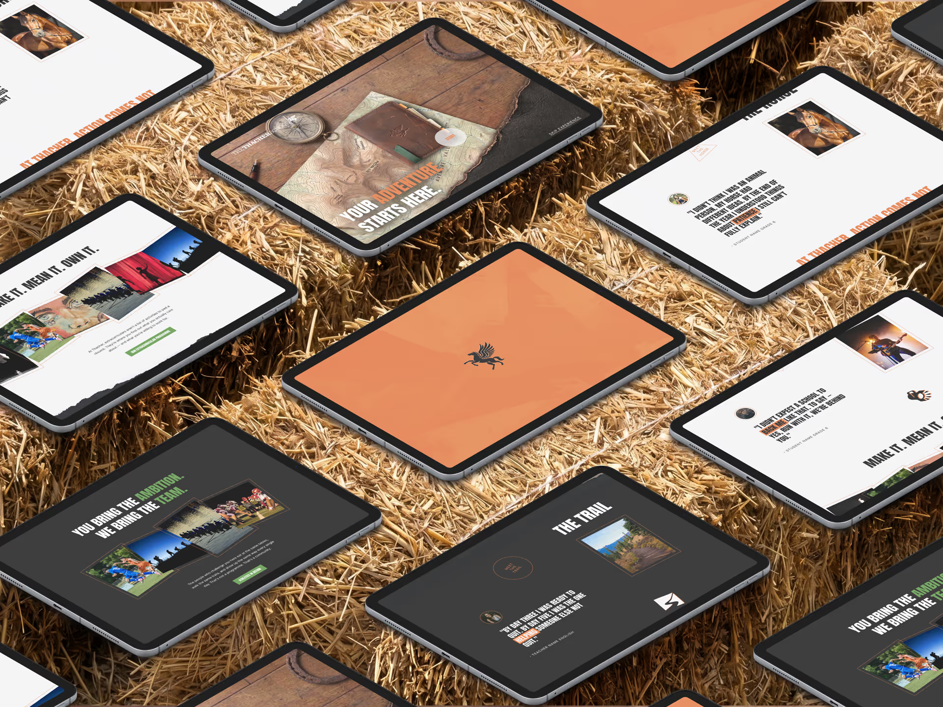
The creative response was a brand world built around discovery and adventure. At its centre, a field notes guide, used as a wayfinding system, it was designed to feel like something you'd find tucked into a saddlebag. The ambition was for this to become a real world piece, something iconic to Thacher that every incoming student would receive on arrival.

Visually, the work leaned into Thacher's rough and ready character. Ripped textures, high contrast, high energy. Typography and layout that felt active rather than polished.
The Website
Phase 04
The site was built to create surprise. Upward scroll animations and gamified interactions give the experience a sense of momentum and discovery that mirrors the brand world itself.

A stamp mechanic tied the digital and physical together. Each section of the site unlocks a stamp, collected in the field notes guide, rewarding exploration and creating a tangible connection between the two.

Navigation was built around choice. Rather than a fixed linear journey, users move through the site by deciding who they want to meet. Meet the students. Meet the faculty. Meet the trail. Each entry point tells the Thacher story from a different angle, letting prospective families find the version that resonates with them.
What's Next
Phase 06
This project is ongoing and the case study will be updated as the work develops and new material becomes available.